Viewing and Editing Graphs of the Musical Performance


|
Viewing and Editing Graphs of the Musical Performance |
|
|
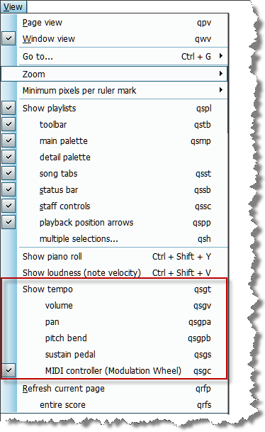
In Composer, you can graphically edit the following types of music performance data:
Composer provides a GraphOverNotestm Palette with a set of drawing tools for editing any of the above types of music performance data. For example, a crescendo (a gradual increase in volume) is displayed as an upward sloping line or curve in the graph of volume level plotted against time in the song. The procedures below introduce how to turn graphs on and off, and how to select the type of graph. It is recommended that you read the next topic, Tutorial On Graphic Music Editing, after reading this introduction. You might want to display the graph of, for example, the tempo in your song, even though you don't intend to edit the tempo graph. For example, as you are adding tempo marks, you might observe an upward slope in the graph of the tempo and decide to add a corresponding accelerando mark in the score.
-- OR --
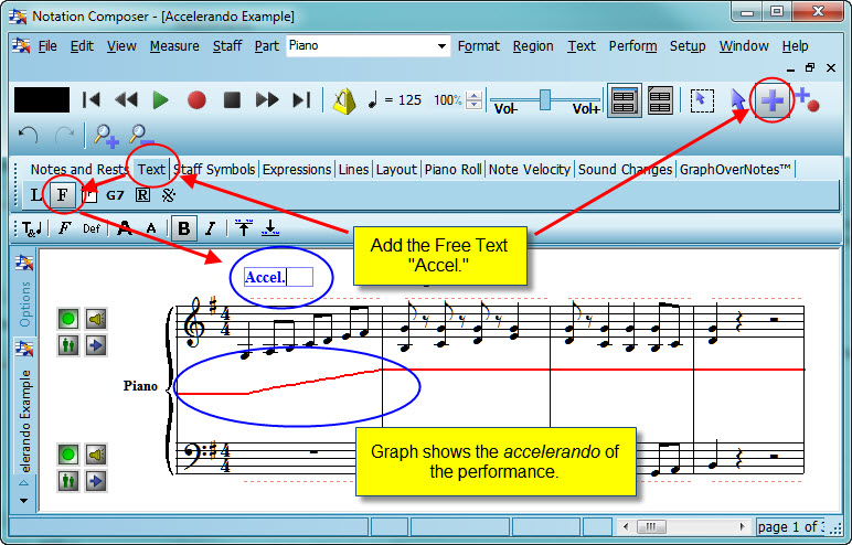
The following example shows how you might use the tempo graph to determine where an Accel tempo mark is needed:
The horizontal red line in the score is the graph of the tempo throughout the song. At the beginning of the song, the line slopes upward, indicating an increase in tempo. If you wish to see numerical information for a graph, then follow click the GraphOverNotestm tab in the main palette, as described in a procedure below.
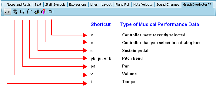
During playback, you can also change the view among any of the six different types of graphs by clicking one of the graph type buttons, such as the Tempo
If you wish to edit the graph, rather than just view the graph, then you will need to click the GraphOverNotestm tab in the main palette.
-- OR -- Type SHIFT+X.
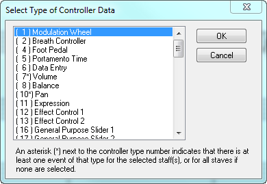
For example, click the Volume -- OR -- Type "v" for staff volume. |


|